In the digital age, your website is much more than just a medium for promoting and selling your products or services. It has become more like a powerful interface between you and your customers developing a relationship that involves communication and influence. It’s your 24/7 salesman as well as the centrepiece of your online presence.
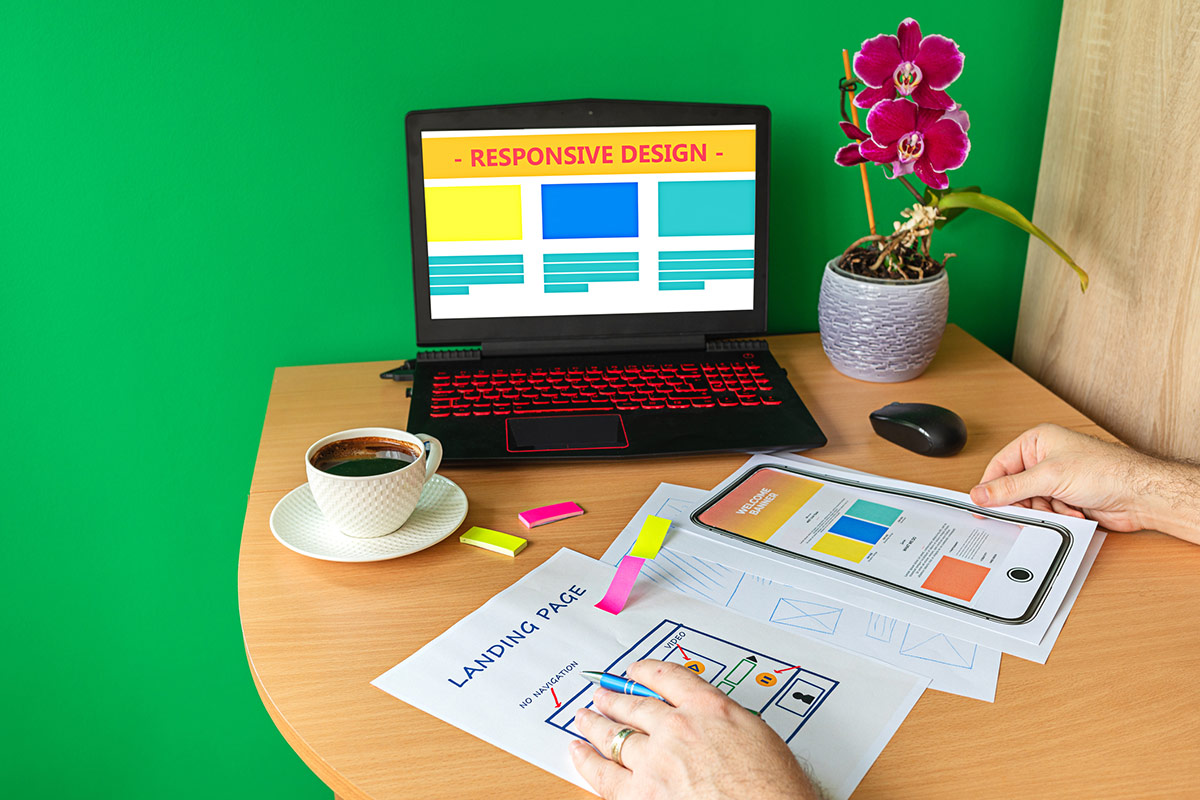
The dynamic environment forces a website to adapt to the ongoing changes and make updations constantly to not become outdated. Web design, a relatively new concept, is always at the forefront of these changes. It’s important to create a web design that is attractive, visually appealing, and in sync with your business values and goals.
We are here to help with some of the best tips and tricks to improve your website’s design user interface.
Optimise the White Space
White space is the empty space between one interface element and another. The element could be anything, from a button to a headline to a menu bar. It is the most crucial and interestingly, one of the trickiest parts of the UI. The key is to create a balanced white space around the elements to optimise relationships between different groups of elements.
The proper optimisation of white space provides a fresh, modern, and organised look to your website. Too much of it can eat up your content and ad space and the contrary might fail to create a systematic interface.
Use Colour Psychology
Colours are capable of provoking emotions and reactions in human minds. Use the colour palette to focus the visitor’s attention on actionable elements and influence their actions.
You may use cool colours like blue and green to represent balance and freshness. Red can be used to launch a promotional campaign tab. Use brown to showcase elegance and sophistication and black as text colour to increase readability.
Wisely Use The Contrast Effect
Make important content like the headings highlighted with the help of the contrast effect. There are certain elements that need more of the user’s attention than the others. For them, you can create a highlighting effect with the help of difference in colour, size, or type of text.
For example, on a webpage, you’d want the elements like your services and the CTAs to attract the user’s attention immediately. You can use a contrasting font element for them to make it highlighted.
This technique is highly recommended for websites that have long-form content. The contrast effect will make scanning the webpage a lot easier.
Play With Labels
Try making the labels like pop-ups, tabs, buttons, and links easily understandable to an extent that they become self-explanatory.
For example, if an error pop-up has ‘Yes’, ‘No’, and ‘Cancel’ as its tabs, it’d require users to attentively read the whole dialogue box. Instead, if its tabs are verbs like ‘Save’, ‘Don’t Save’, and ‘Cancel’, users can select the option and take an action without reading the pop-up box. It’ll enable fast decision making for users.
Hyperlink Differentiation
Hyperlinks, whether internal or external, creates a web-like structure for your website. You want users to easily identify the hyperlinks. Therefore, don’t experiment with the visual cues of the hyperlink format.
A regular web user quickly identifies blue and underlined text as links. Don’t exploit the user’s expectations by using something that they don’t know. Instead, take advantage of the conventional setups. For the elements that are deeply inscribed in the minds of people, don’t try reinventing.
Striking a perfect balance between different elements of a website is User Interface art. Keep experimenting with different tips and tricks and see which one intensifies the art of your website.
To get professional help for your website’s UI design, reach out to Netplanet Digital. Our experts would love to help you and revamp your website’s design- contact us today to book a free consultation.


